Make your packaging socially shareable through bold colour and simple imagery

In the digital age, packaging needs to function both on the shop shelf and on the screen. Increasingly, brands see packaging as not just something that has to work online, but a prominent vehicle for digital marketing. Brands are designed with social shares and vlogging in mind.
And why wouldn’t they when 4 in 10 consumers will share a picture of a product on social media if it comes in premium packaging, one in five consumers has watched an unboxing video and 52% are likely to make a repeat purchase from an online seller if they deliver in premium packaging?
With this in mind, we wanted to delve a little deeper into the exact packaging elements that prompt online sharing and boost a brand’s digital marketing reach.
And the best place to start is to establish the basics – what is it that people like about packaging in 2017, and how can this be translated to digital platforms?
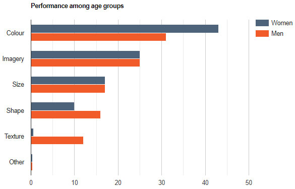
We found that colour and imagery are by far the most appealing features, but that texture is more appealing to men than women. The texture is 20 times more important to men than it is to women, and almost half of women find colour the most attention-grabbing feature of a package compared to a third of men who feel the same.
The results in brief:
- Over 650 people surveyed
- 40% of respondents selected colour
- 25% said imagery
- 1 in 8 men said texture, but only 2 women out of 327 said texture
- 43% of women chose the colour, but only 31% of men did
Tell WePack about your packaging project!
The most attractive features of packaging design are colour and imagery
Over 650 people were asked the question “what catches your attention most when it comes to product packaging?”
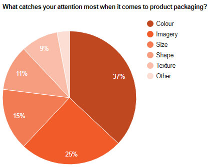
Perhaps unsurprisingly, the visual design of the packaging was selected as the most attention-grabbing feature. Colour specifically, was chosen by 40% of the respondents, with imagery coming second with 25% of the votes. This fits with current research in the industry. Studies have shown that 85% of consumers attribute colour as the main reason for purchasing. Imagery is also integral to garnering attention, especially where brand recognition is low in the first place.
Women, however, are more interested in colour than men. 43% of women who responded chose colour, whereas only 31% of men chose this option.
Texture matters to men much more than women
Interestingly, texture was not a prominent factor overall, those who did choose texture were almost exclusively men.
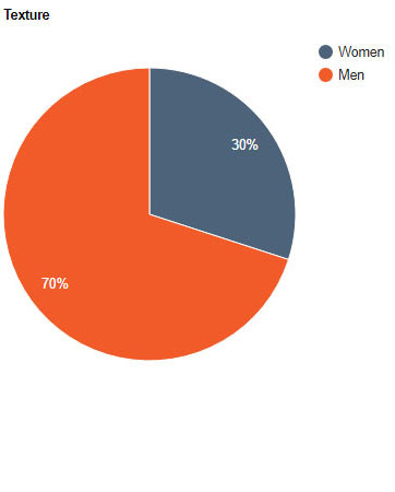
Out of the 59 respondents who cited texture as the most important factor, 70% of them were men. 1 in 8 men chose texture over everything else, whereas only 2 women out of 327 said that texture mattered most.
So how can this data be used to inform packaging design?
How to make the most of colour on digital platforms – a Domino’s case study
Given that colour is by far the most important factor to consumers, choice and prominence of colour should be considered carefully. Picking colours that work well on social media should be a consideration.
There’s a reason why social media brands like Twitter and Facebook use blue. Blue is the world’s favourite colour – 40% of people worldwide pick it as their favourite colour, and men in particular like it.
Domino’s pizza have implemented a strategy that puts colour at the forefront of their pizza box design with the express purpose of promoting shares on Instagram.
The idea was actually pitched to them using images of the packaging on Instagram, under the scenario that if a customer gets two pizzas, and shares the picture on Instagram “you can pretty much use social media to do your advertising for you”.
The key to the box design is simplicity. The Domino’s logo – a single domino’s piece coloured blue on one side and red on the other – was spread out over two boxes.
Food is either delivered in an all-blue box with two dots on it representing one side of the domino piece, or in all red with a single dot on it.
This is fantastic example of how packaging can be used to enhance digital marketing, but the implementation of this wasn’t without work. Domino’s had to invest more in their packaging, change their entire box-manufacturing process and find an ink that wouldn’t distort or bleed when exposed to hot pizza.
For Domino’s the investment was worth it. Keep in mind that designing your packaging for social media can involve extra work. If you want to capitalise on digital marketing be prepared to invest.
So what can be learnt from Domino’s new packaging design? Simplicity of image is pivotal to making the design stand out on social media. A lot of intricate detail will get lost. Remember that you want to communicate with consumers as they scroll through a lot of other content. It’s got to be bold and obvious.
So, if you use colour, really go for it. Domino’s did not skimp and just colour the top of the box – the entire package is dyed to really grab attention.
Colour choice should be informed by what certain colours represent. Here’s a quick rundown of what consumers associate colours with:
A Quick Guide to Colours
- red works for offers and discounts.
- black indicates luxury.
- orange represents warmth and excitement.
- green is associated with nature and wealth; works for audiences that value ethics.
How to sell texture in the era of digital
For companies that want to capitalise on the growth of male products, the news that texture matters to men should be taken into account. Not least because research suggests that interesting textures actually improves sales – consumers are willing to spend more if the package feels a certain way.
Keeping in mind that digital needs to be taken into account, how can brands conquer the challenge of communicating texture via a screen?
The best digital medium to demonstrate texture is video. Videos can be used to show the packaging “in-action” demonstrating an appreciation of the feel of the package live, rather than having to rely on still visuals to get it across.
If you do decide to integrate texture into your packaging, it is well worth backing this up with video content so that you can demonstrate all facets of your packaging to speak to the right audiences and secure those precious sales. Send your product to vloggers for video review or spend your budget on video advertising.
If the texture is a feature, try and ensure the imagery used on the packaging does the work in promoting social shares. So, for example, imitate Domino’s approach of stripping back the package design to the bare minimum – something simple, clear and bold that will create an impression via a shared photo. On the shop shelf and in video the texture can do work; on social media, the imagery and simplicity of the visuals can promote shares.
Ultimately, what brands can’t afford to do is ignore the opportunities that social media affords packaging. Packaging has long been known as an incredibly powerful vehicle to promote sales. The key to capitalising on opportunities presented by evolving technology is to understand how packaging can serve as a unique bridge between the bricks and mortar world and the world of Instagram, Twitter and Facebook.
To find out more about our packing services please contact WePack on 0115 852 9000 or get in touch via the form below.
